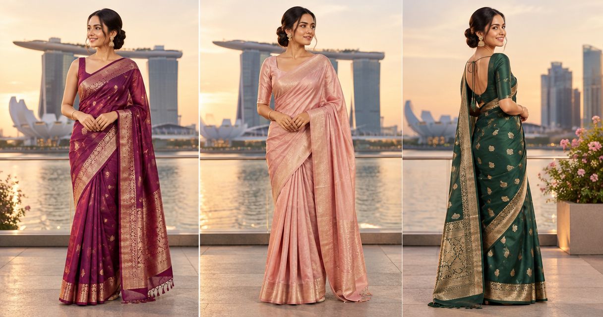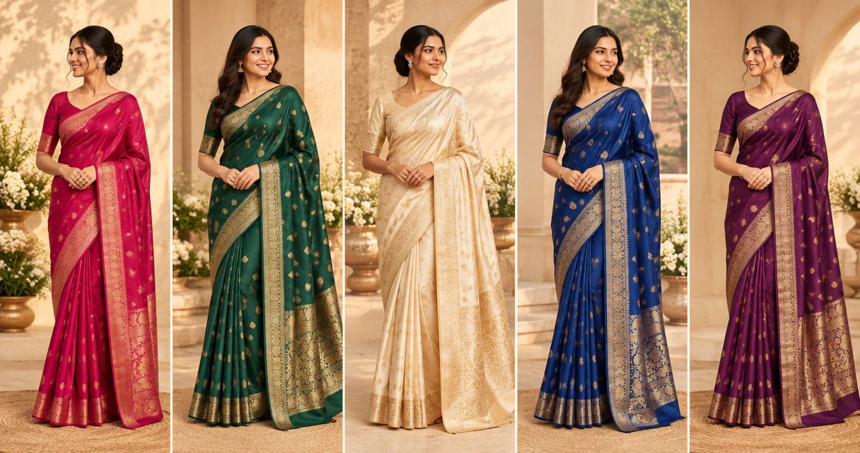
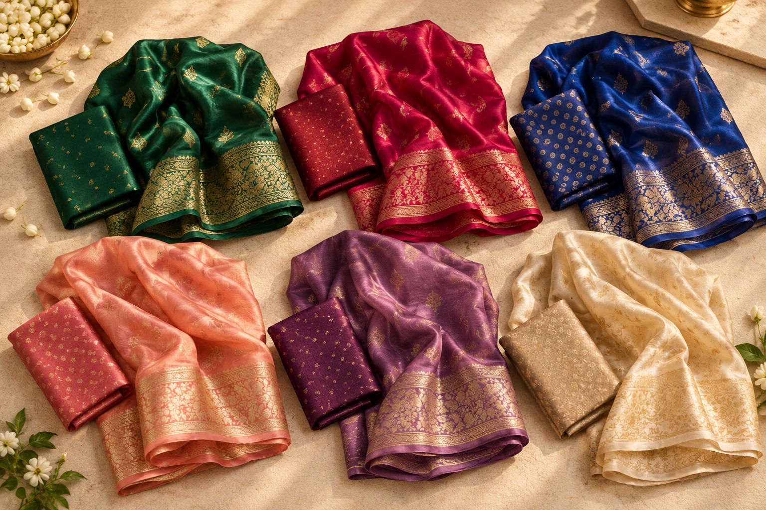
Best overall: emerald or teal. Best for rich, warm colour: ruby or burgundy. Best for a softer look: peach, mauve or champagne. This 2026 guide compares silk saree colours by the effect you want, then shows you how to check each shade against your complexion, blouse and occasion.
- Emerald and teal are the starting picks for silk saree colours when you want depth without choosing red.
- Choose ruby for warm richness, sapphire for cool contrast, peach or mauve for softness, and champagne for subtlety.
- The Fashion Silk suits Singapore shoppers who want personal help comparing saree colours and outfit sizes.
- Compare fabric beside your face; skin depth alone does not decide which saree colour you should wear.
Why this matters
Your skin tone does not come with a compulsory colour palette. Light, medium and deep complexions can all wear jewel tones, pastels and neutrals; the useful question is whether you want contrast, softness or warmth beside your face.
For your 2026 wedding or festive shopping, start with that effect rather than a rule about looking fairer. At The Fashion Silk, you can ask for personal help choosing outfits and sizes at the Simei store. Bring your occasion details and blouse ideas so the conversation starts with your whole outfit, not an isolated colour swatch.
What makes the best silk saree colours?
Use these criteria before choosing a favourite:
- Face-framing effect: Compare the colour beside your cheeks and neckline, not only against your wrist.
- Preferred contrast: Decide whether you want the saree to stand out sharply or sit softly beside your complexion.
- Colour temperature: Compare warmer and cooler versions of a shade instead of relying on a skin-tone label.
- Border and blouse: Judge the colours nearest your face together; a contrasting blouse changes the combination.
- Occasion: Consider the dress code, your role at the event and any family colour plan.
- Fabric appearance: Check the actual material, weave and finish rather than choosing from a colour name alone.
Silk saree colours at a glance
These are colour directions to compare, not named products or a statement of individual stock. Each recommendation serves a different shopping need.
| Colour direction | Best for | Standout quality | Key limitation |
|---|---|---|---|
| Emerald or teal | An undecided shopper wanting depth | A green-to-blue range to compare | Yellow-green and blue-green versions look different |
| Ruby or burgundy | A rich, warm occasion look | Red-based colour with visual depth | Burgundy can feel too dark for a soft palette |
| Sapphire or royal blue | Clear, cool contrast | A distinct blue focal colour | Bright blue can dominate a muted outfit |
| Peach or coral | Softness with a warm accent | A choice between gentle and vivid warmth | Pale peach needs checking beside the face |
| Rose or mauve | A muted, cool-leaning look | Pink with a softer or greyer direction | Mauve can feel dull if you prefer clear colour |
| Ivory or champagne | An understated neutral outfit | Lets texture and borders take attention | Pale fabric needs checking for opacity |
Start with skin depth, then check the actual shade
Skin depth describes how light or deep your complexion appears; undertone describes its underlying colour direction. Neither gives you a fixed list of permitted saree colours. Use the distinctions to organise comparisons, not exclude options.
- Light skin: Compare a pale shade with a deeper alternative. Choose whether you prefer a gentle transition or a defined contrast.
- Medium skin: Compare warm and cool versions of the same colour family. Coral versus rose is a useful starting pair.
- Deep skin: Compare pale colours and saturated shades without assuming either is off limits. Decide which contrast you enjoy.
For a practical shortlist, choose 3 colour candidates and view them near your face with the intended blouse. If an undertone label feels confusing, leave it aside: the actual fabric comparison is the more useful shopping task.
1. Emerald or teal: best for an undecided first shortlist
Emerald and teal are the default starting choices when you want a deep colour but do not want red. Compare a greener emerald with a bluer teal before deciding; those names cover different-looking shades.
Best for: Shoppers who want a clear focal colour for wedding or festive dressing without building the outfit around red.
Emerald and teal pros:
- Give you both greener and bluer directions to compare.
- Leave room for either matching or contrasting blouse choices.
- Offer a deeper alternative to a pastel-led outfit.
Emerald and teal cons:
- The colour name alone does not identify its warm or cool direction.
- A strong contrasting border can change the effect you chose.
Hold the border and blouse near your neckline, not just the plain body of the saree. Buy: choose emerald or teal when you like depth and the complete colour combination works beside your face.
2. Ruby or burgundy: best for a rich, warm occasion look
Ruby and burgundy belong on your shortlist when you want red-based colour with depth. Ruby is the direction to compare for a clearer red; burgundy is the darker alternative.
Best for: Wedding and festive shoppers who prefer a rich red palette over a soft pastel look.
Ruby and burgundy pros:
- Give you a clear choice between brighter and darker red directions.
- Can anchor an outfit without adding another strong clothing colour.
- Let you compare matching, neutral and contrasting blouse ideas.
Ruby and burgundy cons:
- A very dark burgundy does not deliver the same effect as bright ruby.
- Red might conflict with a requested event or family palette.
Check the occasion guidance before committing, especially when a couple or host has specified colours. Buy: choose ruby for a clearer red statement, or burgundy when a darker finish is your preference.
3. Sapphire or royal blue: best for cool colour contrast
Sapphire and royal blue suit a shortlist built around clear, cool colour. Compare the actual shades rather than treating the names as interchangeable: one blue can look noticeably brighter or darker than another.
Best for: Shoppers who want a blue-led outfit with more definition than a muted pastel palette.
Sapphire and royal blue pros:
- Create a distinct alternative to red and green.
- Give a clear colour reference for coordinating accessories.
- Work as the main outfit colour without requiring another vivid shade.
Sapphire and royal blue cons:
- An intense blue can feel too strong if you prefer muted clothing.
- A contrasting blouse adds another decision to an already bold palette.
Start with the simplest blouse combination, then compare a contrasting option. Buy: choose sapphire or royal blue when you want the blue itself to be the outfit's main feature.
4. Peach or coral: best for softness with warmth
Peach and coral are useful alternatives when deep jewel tones feel heavier than the look you want. Start with peach for a gentler direction, then compare coral if you want more colour.
Best for: Shoppers planning a warm, softer outfit for a daytime celebration or family gathering.
Peach and coral pros:
- Offer a warm alternative to pink, blue and green.
- Let you compare a pale look against a more vivid one.
- Provide a starting point for a softer family colour palette.
Peach and coral cons:
- Pale peach can feel too close to your complexion for your preferred contrast.
- Strong coral does not give the same understated effect as peach.
On any skin depth, judge whether you enjoy the soft transition or want a more defined blouse colour. Buy: choose peach for gentleness or coral for warmth with a stronger colour presence.
5. Rose or mauve: best for a muted, cool-leaning look
Rose and mauve give you a softer direction than clear blue or ruby. Compare a pinker rose with a greyer mauve; the amount of grey matters when you are deciding between gentle and subdued.
Best for: Shoppers who prefer muted occasion outfits and do not want a bright focal colour.
Rose and mauve pros:
- Give you pink-based options without requiring vivid colour.
- Offer a useful comparison against warmer peach.
- Leave space for embroidery, borders or jewellery to carry more attention.
Rose and mauve cons:
- A grey-heavy mauve can feel dull if you usually enjoy clear shades.
- A busy border can interrupt the quiet palette you intended.
Compare rose and mauve with the jewellery you actually plan to wear, rather than choosing accessories afterwards. Buy: choose this colour family when softness matters more to you than a strong colour statement.
6. Ivory or champagne: best for an understated neutral outfit
Ivory and champagne are the neutral directions to compare when you want the weave, border or accessories to take attention. They are not identical: compare a less yellow ivory with a warmer champagne beside your face.
Best for: Shoppers who want a restrained palette rather than a colourful focal point.
Ivory and champagne pros:
- Keep the clothing palette simple.
- Let you explore contrast through the blouse rather than the saree body.
- Make fabric texture and border choices central to the decision.
Ivory and champagne cons:
- Pale fabric needs an opacity check with the intended underlayer.
- The event's colour expectations still take priority.
Do not choose a neutral simply because it feels like the safest option. Buy: choose ivory or champagne when you genuinely prefer the pale palette and have checked the complete outfit.
How these colours were ranked
Emerald and teal lead this guide as a practical starting comparison for an undecided shopper. The remaining colours answer separate needs: warm richness, cool contrast, warm softness, muted colour and neutral dressing.
This is a preference-led 2026 buying guide, not a ranking of skin tones. No colour earns its place by promising to make your complexion lighter, younger or more attractive.
Check fabric and fit before deciding
A favourite shade is only part of a wearable outfit. Read the guide to checking silk saree fabric details before choosing by appearance alone; colour does not establish fibre composition.
Bring 2 blouse options, or clear photographs of them, if you are deciding between matching and contrasting colours. Check the neckline, sleeves and coverage you want, and ask for sizing help rather than assuming your usual clothing size settles every blouse decision.
For coordinated family dressing, discuss a shared colour accent instead of requiring everyone to wear the same shade. Keep each person's comfort and preferred outfit style in the conversation.
Visit our Simei store
Visit The Fashion Silk, 04-K5, Eastpoint Mall, Simei, Singapore, open 10 AM–10 PM every day. Shoppers from across Singapore can ask for personal outfit and sizing help while comparing colour directions for their occasion.
For your 2026 visit, bring 1 outfit photograph, your blouse ideas and any wedding or family colour instructions. Explain whether you want a saree that feels bold, soft or neutral, and ask which individual options and sizes are currently available.
The Fashion Silk offers ready stock in Singapore, but confirm the particular saree and size you want. A useful reason to visit is to compare the actual fabric beside your face instead of making the whole decision from a screen.
Which silk saree colours should you choose?
Start with emerald or teal if you are undecided. Move to ruby for warm richness, sapphire for clear blue contrast, peach for warmth and softness, mauve for muted colour, or champagne for a neutral outfit.
For your 2026 shortlist, keep the colour you enjoy wearing, not the one a skin-tone chart says you should choose. The final decision belongs to the saree, blouse and occasion together.
FAQ
What are the best silk saree colours for different skin tones?
Emerald, ruby, sapphire, peach, mauve and champagne are useful colour directions to compare across skin tones. Choose according to your preferred contrast and the actual fabric beside your face, rather than treating complexion as a restriction.
Which silk saree colours should I try on deep skin?
Try both saturated colours and pale shades on deep skin. Emerald or ruby gives you one direction to compare, while ivory or peach lets you judge whether you prefer a lighter contrast.
Which silk saree colours work for light skin?
Compare a jewel tone with a softer shade on light skin. Sapphire creates a different colour relationship from peach or mauve; choose the effect you prefer with your intended blouse.
How do I choose a silk saree colour for medium skin?
Compare warm and cool versions of a colour family beside your face. Peach versus rose, or greener emerald versus bluer teal, gives you a practical comparison without needing a fixed undertone label.
Should my saree blouse match the saree colour?
Your saree blouse does not have to match the saree colour. Compare a matching blouse for continuity with a contrasting blouse for a more distinct neckline, then check the combination with your jewellery.
Can I choose a saree colour from an online photograph?
Use online photographs to make a shortlist, then compare the actual fabric before your final choice. Lighting and screen settings affect how colour appears, and a photograph does not establish fibre composition.
Where can I get personal help choosing silk saree colours in Singapore?
Visit The Fashion Silk at 04-K5, Eastpoint Mall, Simei, Singapore, for personal outfit and sizing help. The store opens 10 AM–10 PM every day; confirm the individual saree and size you want.
One last thing
Before buying, compare the saree with the blouse fabric touching its border. Then move both beside your face. If you like the saree alone but dislike the combination, change the blouse direction before rejecting the saree colour.